The Visual Details That Make a Brand Feel Like Itself
Distinctive brand photography is less about looking impressive and more about looking unmistakably yours.


The Visual Details That Make a Brand Feel Like Itself
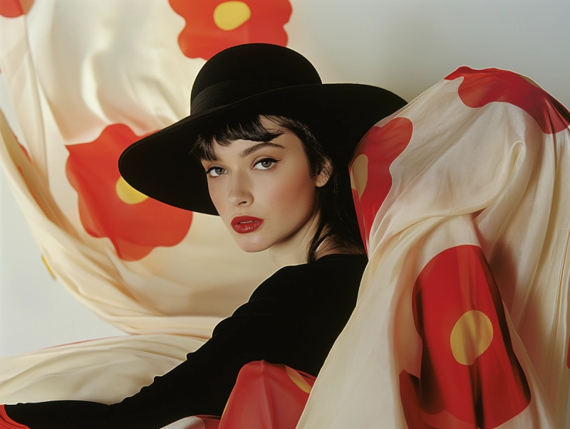
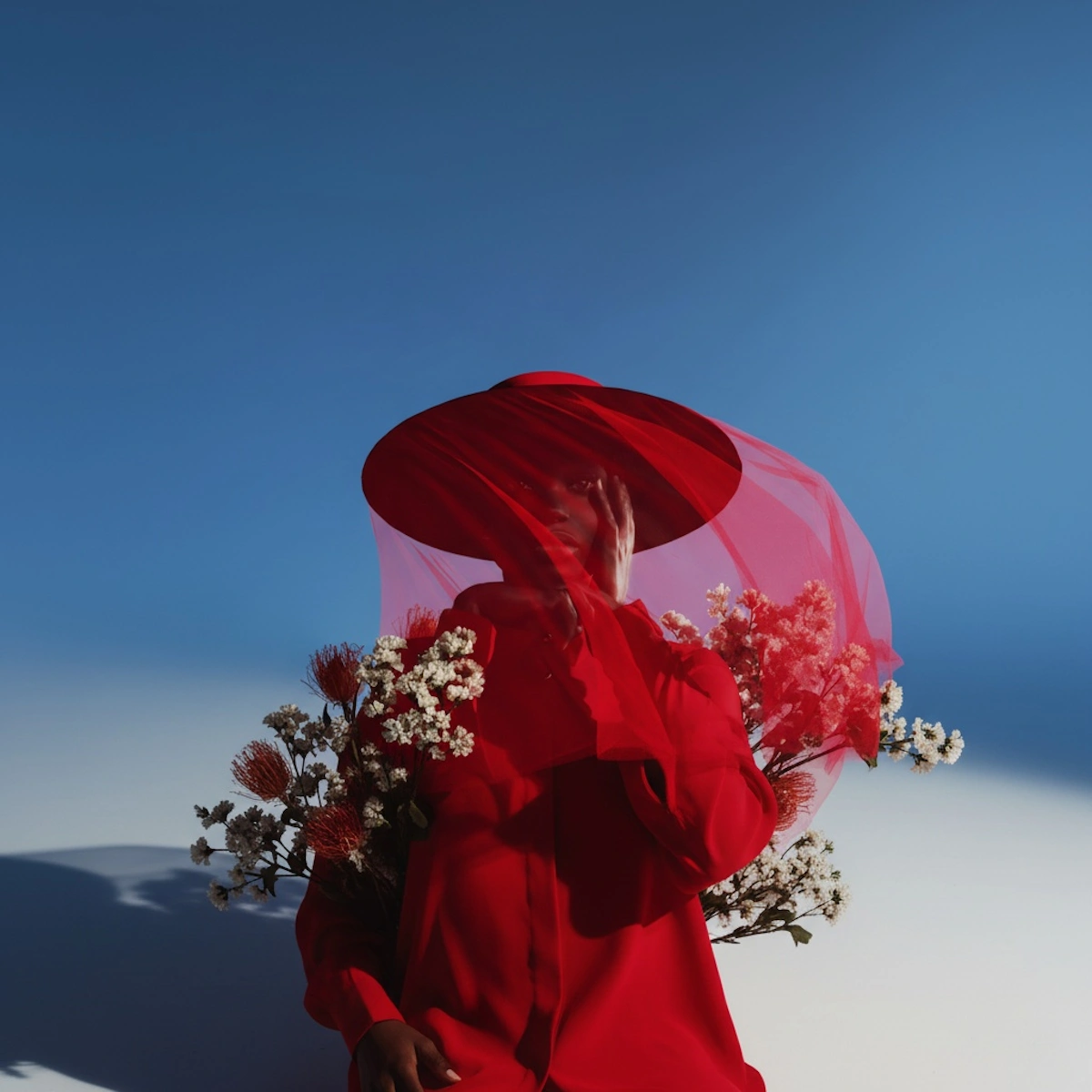
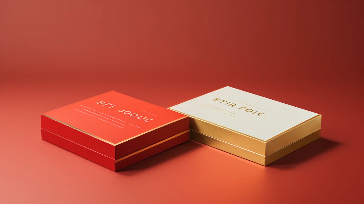
A brand does not become recognisable through a single perfect image. It happens through consistency in the small choices: colour, texture, framing, light, styling, movement, and the way people interact with a product or environment. Distinctive photography is less about making every image look impressive and more about making every image feel unmistakably connected to the same point of view.
Start With Character
Before building a visual direction, a brand needs a sense of character. Is it quiet or expressive? Precise or playful? Warm or minimal? These qualities become useful when they can be translated into visual decisions. A brand that values simplicity might need restraint in composition. A more energetic brand might benefit from movement, stronger contrast, or less predictable framing. The visual language should come from the character, not the other way around.
Consistency Is More Than Colour
It is easy to think of consistency as a colour palette or editing style. Those things matter, but they are only part of the picture. Consistency can also live in the way subjects are framed, the amount of negative space used, the quality of light, the relationship between people and products, and even the kinds of moments the camera chooses to notice. These details create recognition over time.
Build a World, Not a Collection
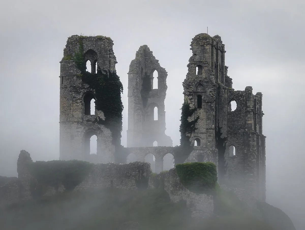
When a brand commissions multiple photographs, the goal should not be to produce a collection of unrelated good images. The images should feel as though they belong to the same world. One frame can be intimate while another is expansive. One can be carefully composed while another feels spontaneous. What connects them is the underlying point of view. That gives a brand room to evolve without losing its identity.
Consistency Without Repetition
There is a difference between consistency and sameness. Repeating the exact same composition can quickly become predictable. Repeating the same visual principles creates recognition while leaving room for variety. That distinction allows a brand to build a photography library that works across campaigns, seasons, platforms, and stories.
Make It Feel Like Yours
The strongest visual identity is not necessarily the one that follows a trend most closely. It is the one that feels difficult to replace because its choices belong to that particular brand. At Croma, that is what we look for. Photography that does more than look polished. Photography that feels like it could only have come from you.
.webp)